

Well, I've made it to Week 3 of the 12 Weeks to Better Photography program that is being hosted by Meredith at La Buena Vida. This week the lesson was on the color of light and how to adjust the white balance of your camera.
Like Meredith, and I'm sure many others, I've always been really scared of white balance. Basically, I've never really understood it and as such I've never been brave enough to play around with it. The Two Peas in a Bucket lesson really helped me though. See I've lectured students every year in Psych 101 about light, how light has different wavelengths which we perceive as color and how the eye sees various colors based on what light is reflected off of objects (NOT what color is absorbed).
What I knew coming into this lesson is that the human eye is really good at adjusting our perception of how light appears based on our expectations of how an object should be colored. So even though an apple might actually reflect a brownish red light, we perceive a brilliant red apple because that's what we expect to see. What I learned this week though is that a camera's sensor can't make this perceptual judgement - instead, we need to adjust the white balance of the camera to ensure that the image comes out looking properly.
In the past I've always played around with white balance in a post-processing program (like Photoshop or Aperture), but today I actually adjusted the WB in my camera. I use a Nikon D60 so I had several options of presets in my camera. I started off with the auto WB setting (where the camera adjusted it itself)...
Auto White Balance
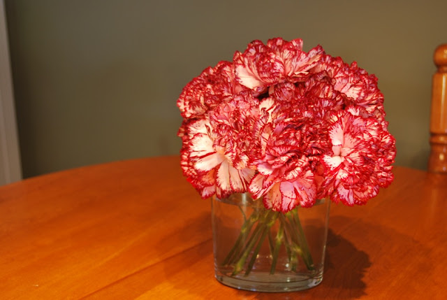
You can see that the table looks especially orange-y and the white part of the carnations appears a little pink-ish instead of the brilliant white that it actually is.
I then tried out the Shade preset on the camera - which was pretty horrible - at least in these lighting conditions...

I thought that the Flash preset might be promising, so I opened my flash and used this option for WB...
Flash

Quite obviously the picture got pretty dark, but the color appears more true-to-life... just really dark...
The incandescent setting was one of my favorites - it seemed to get the color well even though the overhead lights weren't incandescent bulbs.
Incandescent

The last preset that I used was fluorescent and when I chose this I had the additional option of choosing what kind of fluorescent bulb was being used. I chose the warm-white option since this is the type of bulb that we buy when we are at home depot so I figure that was likely what was in this light. This picture is the truest in color to real-life...but to be fair, its not much different than the incandescent one above.
Fluorescent (warm-white)

Finally, I tried to customly set the white balance for the exact lighting conditions of where I was taking the picture as per the lesson's instructions. I started by taking a picture of a plain white sheet of paper in the exact location of the picture I would take. I then used this picture to set the white balance. But disappointingly, this is the picture that I ended up with - worse than the auto in my opinion...
Custom White Balance

I'm guessing this means that I did something wrong within my camera settings, but I couldn't figure out how I went wrong. Here is the picture of the white paper I used for setting the white balance.
Card for Customizing

Does anyone have an suggestions for what I might have done to make this custom WB even worse than the auto setting? All in all, I learned a fair in this week's lesson - if nothing else, I've gained the guts to play around with the menu settings of the camera - what's the worst that can happen right?
NOTE: All these pictures were taken with f/stop=5, ISO=100 and shutter speed was around 1 second (that's why some are a little blurry). Now that I've had some time to think about it, I should have boosted my ISO to at least 800 since I was inside in dark-ish conditions which would have allowed me to have a faster shutter speed.
NOTE: All these pictures were taken with f/stop=5, ISO=100 and shutter speed was around 1 second (that's why some are a little blurry). Now that I've had some time to think about it, I should have boosted my ISO to at least 800 since I was inside in dark-ish conditions which would have allowed me to have a faster shutter speed.
Next week we get to tried out the flash - woot woot!!


7 comments:
Great job! The gray/white card is maybe 10" square... It is marketed as "collapsable", but we haven't really tested out that feature. My hubby said that they had smaller ones online on amazon.
Are you sure you 'set' the CWB? Maybe something else that caused it was the ISO being 100. I had mine at 800.
I could be wrong since I am new at all this so this is my first time trying to help someone out.
I tried some last night too. I did not have much time to write down all that I tried but I could not get the white sheet to auto adjust either. it made my picture worse as well. I will have to try again and use more of the features. Good job! Love the carnations!
My pictures looked like that too at first--turns out I hadn't actually hit the "set" button when I was trying to set the custom white balance. Which camera are you using?
As far as J goes on my blog, I think he secretly loves being written about...he reads the blog every day! I do try to keep it mostly positive or funny though...
I'm not going to be able to answer your question as to why the custom WB didn't work. But thank you for showing all of the different pre-settings. It's really helpful to see.
I had the same problem and found that I didn't set mine correctly. I had to google my camera to figure out how to do it. I don't take an actual picture on mine. I choose custom wb and then hit display and the camera clicks and then I hit function to actually set it. Just like when you change to tungsten or any other setting how the image looks in the display should change. I could tell right away that I finally had it set correctly.
My custom white balance works differently, since I don't have a dSLR. I really like all the examples you used. It really shows the importance of correct settings!
For my pics--I cheated and rested my camera on a table to take the pics. I think that helped them be less blurry.
Post a Comment